
samusfairchild

23684

604

22

So.
In addition to https://imgur.com/gallery/i-have-covid-you-get-smol-ramps-dump-uP2wgTy bad ramps, also collect examples of bad graphic design. I'm sure these will be useful now that I'm managing of some very green designers...

Spacing: Draw a rectangle around each character that touches the top, sides, and bottom. The distance between the boxes? That's spacing. It's usually good when there is some.

Kerning: Consider the shape made between adjacent edges of two characters, but keep it only as tall as the shorter of the characters. That is how a kerning do. If your letters touch (assuming non-cursive English) you're prolly doin' it wrong. If its not English, don't ask me.

Tracking: The spacing between each letter in a word.

Bowl: The fully closed, rounded part of a letter.
Aperture: The opening of a partly enclosed character, like seen in C.

This is likely edited, or we'd see similar crowding between the "c" and the "k" that we see creating that "d."

But C's are honestly ripe for shit like this. Check your legibility. Nobody likes ~~Trusty Clicks~~ Crusty Dicks

Baseline: The bottom edge of a font that the letters are typically aligned on.
Cursive: a style of handwriting where the characters joined and flow into one another. One of the hard parts of that is figuring out how to write characters that don't return to the baseline.
Stem: usually, the main vertical part of the letter.
A cursive "n" has a stem at the beginning of a the letter. A cursive "r" does not. Don't do it, don't add that stem, you Curt.

See, now this one? Genuine. And I bet they knew what they were doing.

Drop Cap: A large, often decorative letter that spans beyond just one line, often taking up three or more lines. It's used to denote a new section, or just to be fancy.
Get too fancy with it, though, and don't mind your kerning, and you end up with factory farts.

Decorative fonts can be nice, but not when they're in all caps.
What's that? That's not the problem with this sign? I mean, it's certainly *A* problem with the sign.
Fap Room, you say? I don't see a problem with advertising that.

Descender: The part of a character that descends below the font's baseline. See, the "s" doesn't have a descender, so we assume that bit is superfluous decoration.

I am a special aunt!
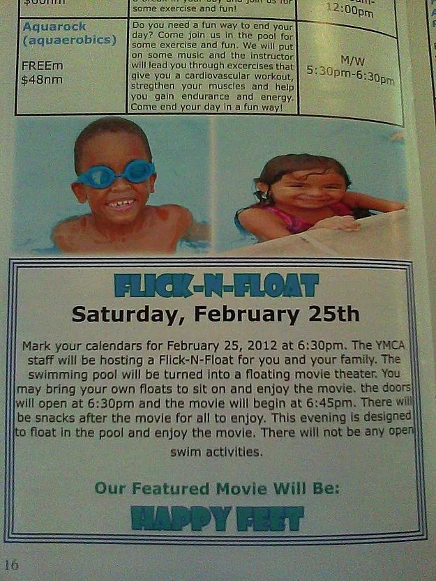
Stroke: The outline of a shape, often done in a different color than the body.
Kerning. 90% of this crap is kerning. This one is stroke AND kerning, which i guess is kinda appropriate for a swimming thing... Shame that's the only thing appropriate.

I guess it better than taco farts.

Did you know you're supposed put spaces between words? It's unimaginatively called "Word Spacing."
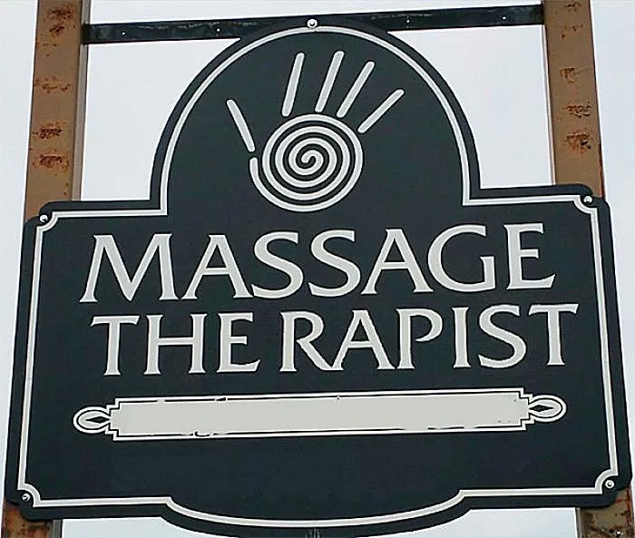
Conversely, don't put spaces within words. Also, never take advice from badly laid out signs.
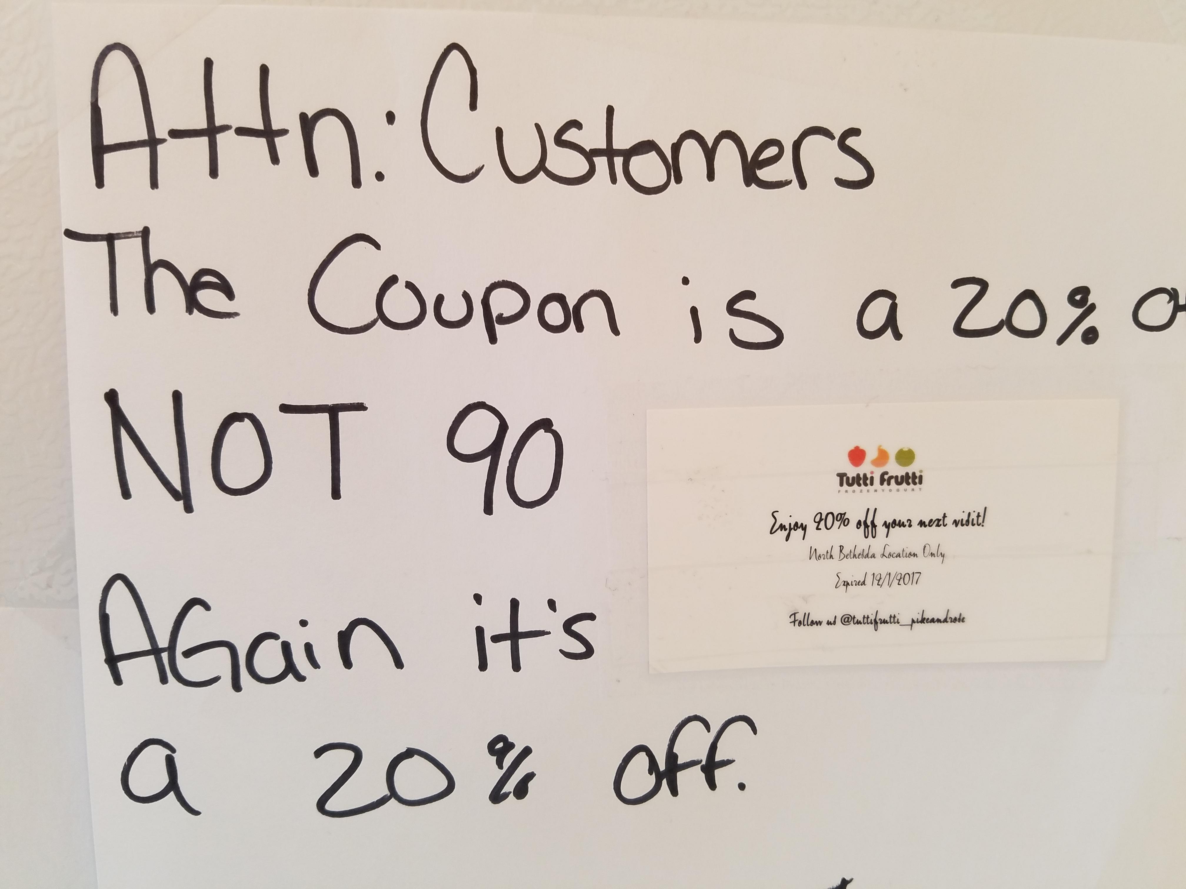
I'm on the customer's side here. That clearly says 90%. A "2" in that font should not have a bowl. Give the customers their 90% off and take a class in typography.
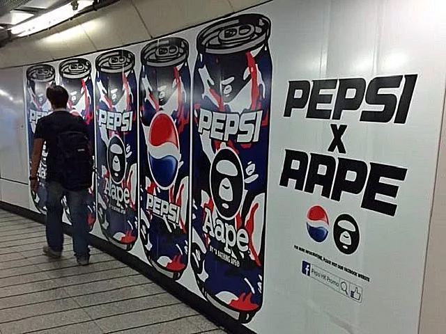
I don't know what the "R" looks like in this font, but if there's enough ambiguity to read this how you probably read it, your font is fonting wrong.

So we have an example of an "a" and an "o," and we can clearly see the difference. I give it some leeway cuz I'm pretty sure this is handwriting... but still, if you're going to ink that shit, make sure your "h" doesn't REALLY CLOSELY resemble an "R." Character ambiguity bad.

See above. It's "Rope Your Dreams," in case you were wondering.
Your should not be capitalized. But now I'm just nit-picking.
Edit: Hey, mashed potato brain, yes it should be capitalized. Pronouns are always capitalized in Title Case.

Yeah, I getting bored of writing up explanations. I'll just let the rest speak for themselves.


This would be better without the dash.

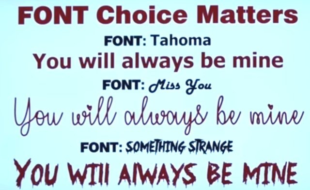
Sechran
SpeakerToLampposts
Ricobe9
Working with graphic design myself, I've had to fix of some stuff clients had prepared because it was just a graphical mess
graehall
K E R N D O W N F O R WHAT!
polarbearbaby
This was educational! Thank you!
samusfairchild
I like to help people learn! Whether they want to or not!
ElorYosnak
What am I supposed to or not supposed to be seeing with Flick- N- Float?
thelonepig
Fuck n Float
ElorYosnak
fascinating, I don't see that even if I'm looking for it. Cool!
19marcurious57
ReallyOG
#2 - Fuckering Lights sounds like Kate Bush’s less successful follow up to Wuthering Heights
mm2k
#1 it worked.
509tigerfish
RevolutionOnHerLips
Crust No One would slap if I owned a pizza place
Schoctane
I also hate unnecessarily mixed fonts. It can be useful for titles or to make a specific word stand out but if every other line is a different font I think less of whoever typed it out.
samusfairchild
As you should. There are some cases where it can be part of the message, and yeah, that's fine, I guess. But nobody wants to read a damn ransom note.
thelonepig
#21 How come "Your" should not be capitalized?
Skevoid
It should be capitalized, OP made a mistake.
samusfairchild
Skevoid is correct. My brain is very mush, lol
igglebotato
#11 see, I read "Tap Room" but "Draught Deer"
samusfairchild
My brain keeps trying to turn Draught into naughty for some reason.
igglebotato
"naughty deer" is a more different part of this website
Madringo
I work for a printing company, and I find that 80% of the time we catch stuff the client says it's fine, print it.
samusfairchild
I have been on both sides of that. I would say 50% of the time, I am too lazy to fix it. Wait! No! I mean I would never submit an error like that to print in the first place! Nope. No errors here.
The other 50%, I've already been shuffled off to another project, and it's a manager that gives the OK.
I've also stared at a client's print file and just been like "meh, they submitted it, they're clearly OK with it.".... I guess the moral here is that I'm lazy, and it's fiiiiine to print that.
ahernandez
Rope for change and rope your dreams
509tigerfish
SpeakerToLampposts
As usual, there's a relevant xkcd (https://xkcd.com/1015/):

samusfairchild
Can confirm, it do be like this.
htapoicoS
Too bad most of those are fake, the bad quality does its part
samusfairchild
I'm not going to opine on which are... unedited (outside of the ones I already did that to), but I can say that shit like this gets to print more often than many people realize. Young/green designers especially tend to overdo it with the fontaciousness. Still, I guess it doesn't really matter if the designs are tweaked or not for the purposes of illustrating what not to do.
firni
Also those with OCD. *twitch*
realGeorgelucas
#12 "Fart" in Danish means speed, so either way they are fast tacos
JBloodthorn
Some men just want to see the world bum.
samusfairchild
You stop that.
DrewThe3DPrinterGuy
#9 Lmao that's from GTA 5.
Wasnbo
Art imitating life.
htapoicoS
At least this one isn't photoshopped
samusfairchild
Pfft I knew they knew what they were doing lmao
In all the times Ive seen this one, how the hell have I never caught that
LiarLiarPantsUntier
‘Cause you need to game more!
samusfairchild
My good dude, GTA V was only released in 2013. I need time to get around to a game.
LiarLiarPantsUntier
Kids?
samusfairchild
Nope. Just really, really bad at getting stuff done..
3Davideo
See also:
AtmaDarkwolf
Heh don't feel bad, for a (quite along time actually) was lots of morning news shows showing off screenshots viewers sent in of GTA V (And online) and RDR2 telling them they were photos of sunsets/sunrises/etc :D
samusfairchild
I knew about this one! Like, not that there were lots, but that it was happening. And I was delighted by it. Kinda like those times when my phone rang in public, and I had the MGS codec call sound as my ringtone (in the before times when ringtones didn't make me want to hurt people). The amount of people who would just subtly light up at it made me feel warm and fuzzy inside.
Marsupialmessiah
Pißswasser? And you havent seen the logo for the computers "fruit computers"?
Cataleast
A lot of the branding you see in GTA5 has varying degrees of innuendo, double-entendres, references, satire, or commentary.
Some examples: Pißwasser beer, 69 Brand cigars, Caca clothing, Bean Machine coffee shops, Penris banks, Guido Zenitalia clothing, Beat Off headphones, GoPostal mail services, DP electronics, Queefstat electronics, Lifeinvader social media platform, Pfister automobiles, Post OP courier services, etc...
DuineSgith
Juank Air, Vank Hoff in the Park, Didier Sachs, Gruppe Sechs, ProLaps, Been Flickin', Herr Kutz, and my personal fav Fud's Brazilian Waxing. Some of the name were fucking brilliant.
do7rkb5n
But not Rusty Brown's Ring Donuts?
Aranon1183
The stamping on bundles of lumbar say "FAP-FAP". Lol
goflyblind
samusfairchild
Fuuuuuuck this. My god.
Evenmoreuselessname
I recently made a font of this cross stitch pattern. It's... difficult to read and the kerning isn't amazing :-P. /gallery/update-i-made-font-file-out-of-this-i6ym6TF
Evenmoreuselessname
Also, I accidentally misspelled "sphinx" in my demo image 😬
samusfairchild
If you don't make a weird mistake, is it really an imgur post?
Evenmoreuselessname
Truth 😬
samusfairchild
I saw his yesterday and showed it to husband. For as decorative of a font as it is, I find it surprisingly easy to read. Not, like, objectively easy, but I can actually think of places or situations where I'd use it. I find something about it quite satisfying. Maybe it's the cats, lol.
Evenmoreuselessname
/gallery/i6ym6TF/comment/2496658015 there's also this one I did, but before I ever posted it, someone posted a copy someone did before. Mine was not brush strokes but static lines (more formal looking) and I changed the way n, k, and w worked and tightened up i, m, s, u, and z for readability. But I never did the final conversation because it already exists *shrug*
samusfairchild
It is a very adorable font. My favorite is the "X" for some reason. Why not finish it if you're already that far? I mean, yeah, redundancy and all, but if youve got all the glyphs made, you could still do it, as a treat, lol
Evenmoreuselessname
True. Maybe I'll just do it tonight after work for that feeling of completing a project
Evenmoreuselessname
Also, I need to figure out the character width and kerning functions in FontForge better. It'd be good practice.
Karma1970
hotforbagels
This is giving me hives.
Karma1970
19marcurious57
samusfairchild
....well that's just unkind. I suppose I deserve it.
MichikoTheJungleFox
Ah I love messing with keming.
neverpostsoriginalcontent
samusfairchild
https://media0.giphy.com/media/v1.Y2lkPWE1NzM3M2U1bmFoNGo4ejh1b2dzdTZuYm16YzFkbHFpbXl0MWxmajk2ZWQwbzl5ZiZlcD12MV9naWZzX3NlYXJjaCZjdD1n/boeE9eYKsBTIdnuJG8/200w.webp
TheJusticeMitchell
straha242
Hah, beat me to it :)
stryhf
Knifesmith
#3 I'll Take 3!
Alice3173
You're going to take three anals? Hopefully not all at once. That sounds like it'd be terrible for your health.
Knifesmith
Don't doubt my capacity for shenanigans!
firlefranz
It‘s called „TAP“, huh?