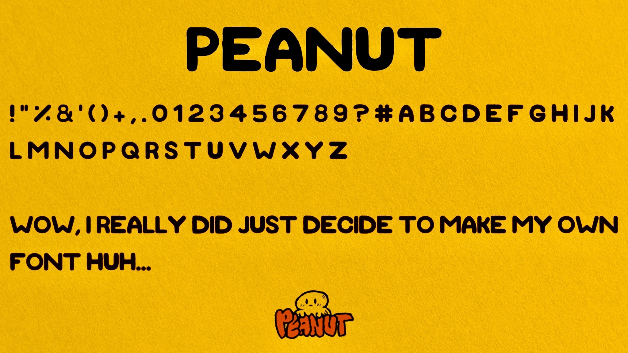
I miss the old Macromedia Fontographer. It made it easy to create your own fonts you could use anywhere and with a full suite of characters. I think Adobe killed it off when they bought them out over 20years ago. Looks like a cool specialty use but I'm not feeling your 3 though.
I highly recommend looking into calligraphr and importing it to a digital suite, make your typeset, and then upload them to create a useable and downloadable font. It worked out for me and I just used Procreate to physically draw out the glyphs. I appreciate your comment btw!!
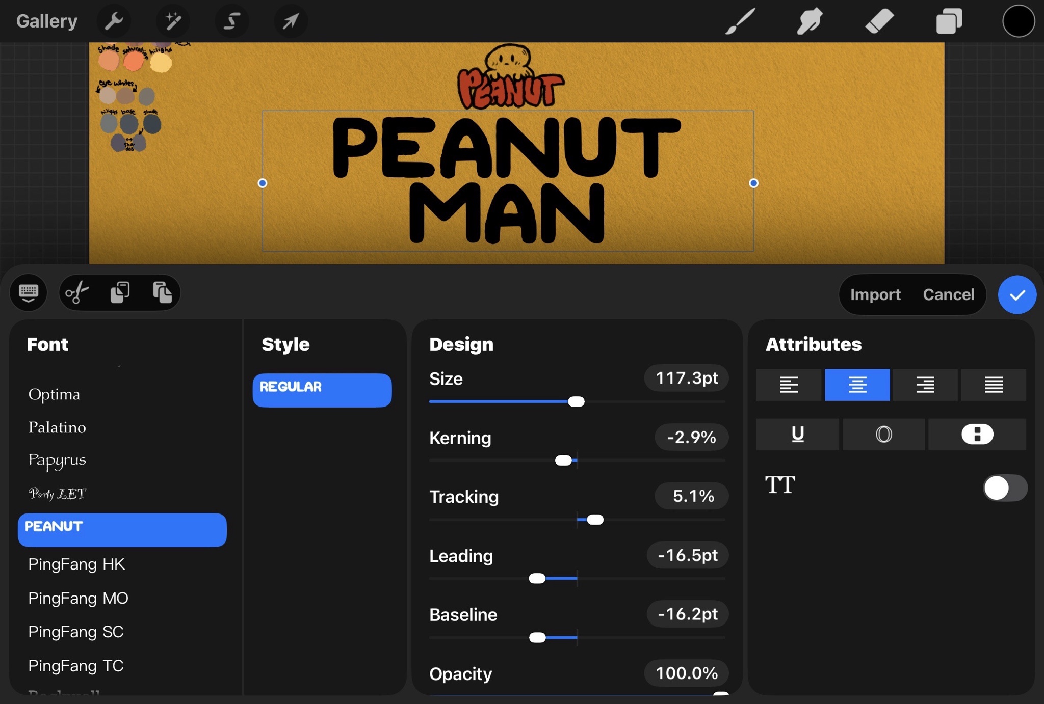
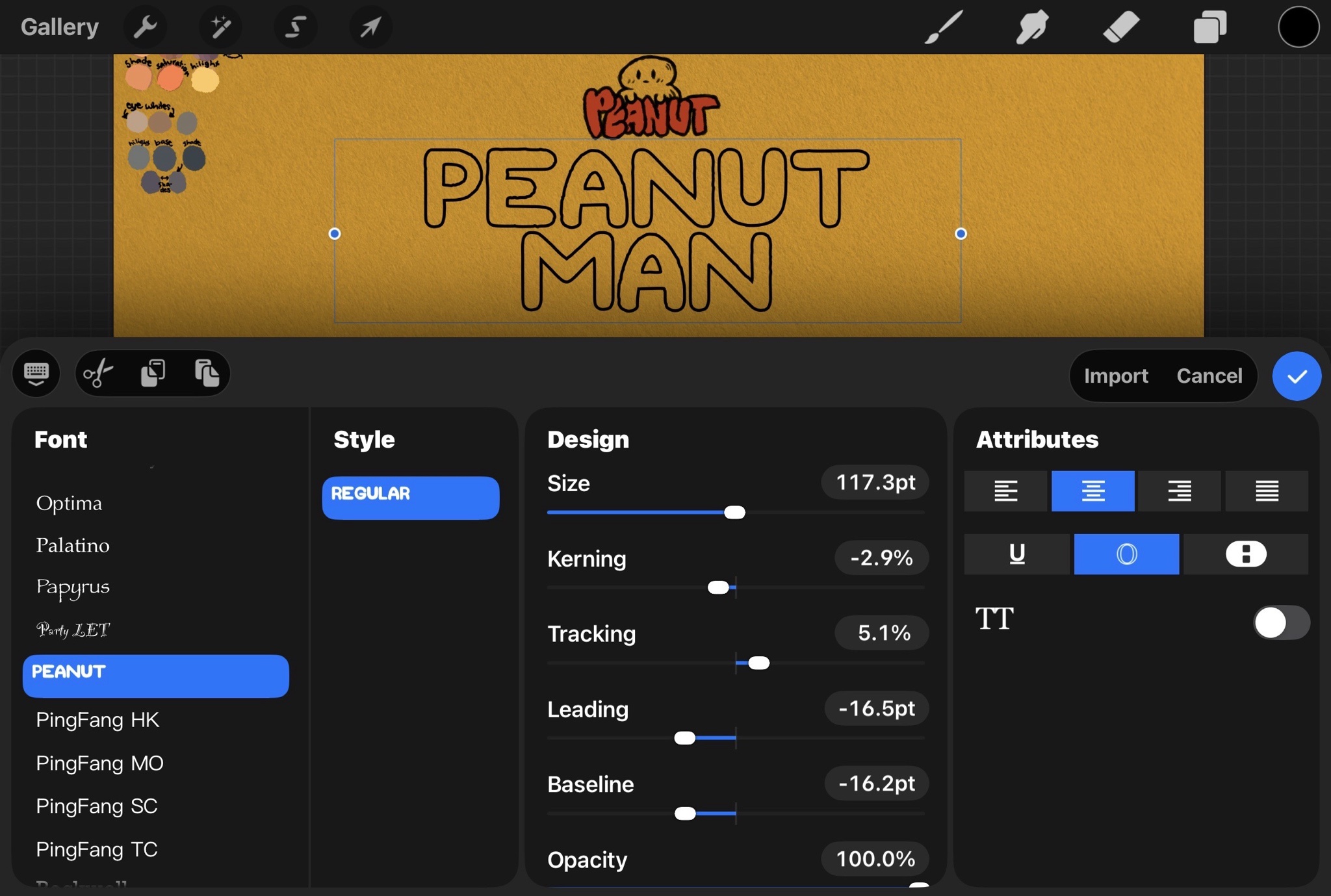
I’m also not feeling the 3 as well. I’ve gone in and done some more adjustments this evening and plan to upload the updated version with the critique I’ve received so far. If you have any other suggestions please feel free to throw them out! I’m a newbie so this was just my first attempt and I’m eager to make more!
Appreciate it the comment! I actually got some feedback similar to yours and have since adjusted it. I just through together the updated version and it will be the second picture in this post.



redsmerf
...aren't foxes more known for being red?
mirrorz
I miss the old Macromedia Fontographer. It made it easy to create your own fonts you could use anywhere and with a full suite of characters. I think Adobe killed it off when they bought them out over 20years ago. Looks like a cool specialty use but I'm not feeling your 3 though.
wejustdontknow
Ahhh Macromedia. The classic days of Dreamweaver and Fireworks. Sighhh
LocalRecluse
I highly recommend looking into calligraphr and importing it to a digital suite, make your typeset, and then upload them to create a useable and downloadable font. It worked out for me and I just used
Procreate to physically draw out the glyphs. I appreciate your comment btw!!
psych0bunneh
The three is all cheek and no crack
LocalRecluse
Nooooo!! How can I make the crack more prominent in this style? LOL https://media0.giphy.com/media/v1.Y2lkPTY1YjkxZmJlcjNrZ2E3cjJicHU4MjBudzc0NnVqeTk2OWo1eWI1NHA1OGZta2tpdSZlcD12MV9naWZzX3NlYXJjaCZjdD1n/13EUIwdK9g17cA/200w.mp4
LocalRecluse
I’m also not feeling the 3 as well. I’ve gone in and done some more adjustments this evening and plan to upload the updated version with the critique I’ve received so far. If you have any other suggestions please feel free to throw them out! I’m a newbie so this was just my first attempt and I’m eager to make more!
Baalzak
Take a little weight off the Z and give it to the 3.
LocalRecluse
Appreciate it the comment! I actually got some feedback similar to yours and have since adjusted it. I just through together the updated version and it will be the second picture in this post.
LocalRecluse
Oh oops I can’t add any additional photos to edits so I’ll just quickly post it and you can check it out!